As I said in my previous post, I will be reviewing in detail each part of the Nokia N900. And I’ll start off with its brand new OS; the Maemo 5.

Remember what I told you before about having a sort of learning curve when you use the Maemo OS for the first time? Here’s one good reason why.

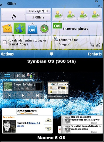
I certainly wished that Nokia took a cue from its simple and easy to navigate Symbian OS, and adapted it to the Maemo OS. Instead they created a brand new interface that can rather be daunting specially for first time users, since it does take some time to get used to. Another difference is the desktop screen of Maemo. Here’s a quick comparison with the Symbian OS.
I like the fact that you can customize the look and feel of your desktop in the new Maemo 5 OS. Add the fact that it has 4 multiple views, its definitely an upgrade over the Symbian OS. However, getting used to it can take awhile, as I do miss the easy to find menu buttons from Symbian. One thing that needs to be noted though, is that portrait mode is NOT SUPPORTED in Maemo 5. The only time the fone ever goes to potrait is whenever someone makes a call, but that’s it. Unlike the Symbian which allows for both portrait AND landscape views.
One thing they did manage to add to improve the experience is an improved kinetic scrolling (similar to the ones used in iTouch/iPhone) and it works just as great. It is integrated into almost all of the menus and makes going from one app to another a breeze.

Multitasking is definitely one of Maemo’s strong points and its very easy to switch back and forth from one app to another. However, running too many programs can definitely chug down thefone and that’s expected. Atleast its great that Nokia included the ability to mutitask nonetheless.
All in all, the Maemo OS delivers a fresh take to Nokia’s interface. It’s fresh, sleek and very stylish, however it does have some issues with being user-friendly specially for first-time users coming off the Symbian OS. I know there’s a tutorial built-in the N900, but Nokia is known for its simple and easy-to-use interfaces on their fones and they should have kept that tradition in building the Maemo OS for their N900.


great article!
ReplyDelete@Frankie:
ReplyDeleteThanks! I'm glad my post was good enough in your opinion. I tried as much as I can to be objective with the unit, despite the fact that I'm slowly falling in love with it. Arrrrgggghhhh!! I definitely see potential with the Maemo 5 OS, but it does need some tweaking and I'm hoping that future updates would give the OS a much needed improvement on its interface, as well as other kinks I've found. ^__^
I couldnt agree more with you. I recently trial it too and its just AWSM!
ReplyDeleteCheck my review here,
ReplyDeleteinspect-aa-gadget.blogspot.com
@Zohaib:
ReplyDeleteYeah!! It definitely is much more than just a fone, and like I said earlier, I'm starting to fall in love with it. Sigh... This is bad. Anyway, I checked your blog already, and following it. ^__^