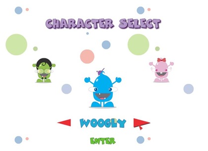
Well for the most part, the game doesn’t look cool. Not one bit.
Let’s start with the main menu.
 The main menu itself looks pretty bland. My biggest gripe is the way the menu itself was designed. Why couldn’t the developers simply placed the “Start, How to Play, & Credits” in the middle of the screen is beyond me. They just wasted like 3/4 of the screen with nothing. Add the fact that the menu buttons themselves aren’t even designed well to stand-out or “pop” out of the background so that players can easily see them. Definitely not cool.
 Next is the characters themselves. I was really disappointed in seeing how they are designed. It feels and looks like a sloppy flash work. I would have really loved it if they looked more like this:
 Now THAT definitely looks way more better. It’s just sad and disappointing that they couldn’t have done a better job with the game’s presentation, considering that they are touting the game as "the World’s Coolest Word Game”. Those are big words really, and from what I see here, it’s not even half as cool as the other word games I’ve seen on facebook. Not to mention word games on PCs.


No comments:
Post a Comment